In this article, we’ll review everything there is to know about formats, but also the choice of paper, whether or not to laminate, not forgetting the graphic elements to insert to increase visibility.
Business card formats
Originally, there was a standard or rather traditional size for a business card: 126 mm long by 80 mm high.
A name was given to this type of card: the “30” format.
This was a good size, and it wasn’t always easy to carry around with you!
But today, many models have been reduced in size to make them more practical for everyday use.
Rectangular business cards measuring 8.5 x 5.4 cm are commonplace, and can easily be slipped into a pocket.
You’ll notice that the dimensions are not far removed from those of a payment card.
Format and orientation: horizontal or vertical?
Of course, there’s nothing to stop you from having it printed in landscape format, i.e. horizontally, or in portrait format, which corresponds to a vertical orientation.
However, this choice is not insignificant.
Horizontal format makes it easy to insert a logo, as well as long information such as an address, which can then be seen at a glance without having to skip lines.
The vertical format is more suitable for a large image or logo, which can be appreciated if, for example, you have a professional activity related to design, or if you represent a company with a well-known logo.
What about square format?
This is also an option not to be overlooked, as this balanced format is less common than the others, making it easier to attract attention.
The square side really invites you to concentrate on what’s inscribed.
Graphic design must be meticulous to respect the particular balance of the four equally sized sides.
What are the advantages of double cards?
Double cards are business cards generally folded in half, made up of two parts of equal dimensions (each the size of a conventional business card), which fold over each other.
They’re a good choice if you’ve got a lot of information to share, such as a map: it can then take up a whole side to remain clearly legible.
The double business card is also a good choice if you’re a retailer and want to communicate a list of products you sell, or specify different services your company offers.
How to choose the right paper and weight?
Apart from its strength and appearance, the quality of the cardboard and/or paper you choose influences the overall perception.
For example, if you work in the luxury sector, presenting a business card that’s extremely soft and folds easily could give a “low-end” image of your company.
Similarly, if you’re an express delivery company and you give out extremely thick business cards, with very distinctive typography, satin lamination and innovative graphic effects, this is likely to raise questions…
As a general rule, we recommend that you choose a paper weighing at least 300 grams/m2, so that it’s pleasant to hold, yet strong enough to withstand the rough treatment of a pocket or wallet!
Should I opt for a matte, satin or gloss finish?
Before answering, you should know that technically, if you choose a gloss or even satin lamination, it will be very difficult to write on the card if, for example, you need to add a piece of information.
In this case, you’re better off with an uncoated business card.
As for the look, matt lamination is very soft on the eye, and can be interesting if you have a business offering personal services such as beauty care, hairdressing or home medical assistance.
A gloss varnish will catch the eye with its vivid colors.
It’s often flattering, but sometimes too much so.
Imagine an undertaker distributing high-gloss business cards in bright colors: it could be counterproductive…
But of course, there’s nothing to stop you from being totally innovative in your sector!
A good compromise is the satin finish, which offers a velvety feel and good color brilliance without ever “assaulting” the eye.
Is it worth printing with gold or using selective varnish?
Why not, but as always, sobriety is better than unashamed fantasy!
Selective varnish is interesting if, for example, you want to highlight a particular element such as an image, logo or title.
But don’t overdo it!
As for gilding, it can be very interesting if you want to give your business card a special character, but you mustn’t overdo it either, or you’ll end up looking heavy and sometimes a little “kitsch”!
Our advice is to keep it simple and add one or two original graphic elements to the finish.
Business card design and construction
Once you’ve decided on the paper or cardboard, the lamination and the horizontal or vertical orientation, the next step is to design the card, integrating all the relevant information.
Choosing typefaces and typography
Here again, we recommend a sober approach: avoid mixing very different fonts, and above all, don’t use more than three colors at most.
The more varied the graphic information, the more the eye will tend to wander, and therefore not retain the main information.
Also, don’t hesitate to choose two or three different font sizes: this will give you the opportunity to highlight what you feel is relevant, and will enable your audience to clearly differentiate between the information presented.
Also pay attention to legibility: no dark gray background with black letters…
Or yellow letters on a white background…
It’s not pleasant, and if it takes effort to decipher, many of your contacts will get bored…
cOur advice is simple: write in light if you’ve chosen a dark color for your business card, or vice versa.
Single-sided or double-sided?
It simply depends on the amount of information you want to convey: sometimes it’s better to occupy both sides of the business card rather than reduce the font size to try and fit everything on one side!
Think of the people whose eyesight isn’t perfect – they’ll thank you!
Quality of illustrations and logo
In the digital world, you know that the sharpness of an illustration is expressed in pixels per inch, which corresponds to the quality of the image, and therefore of the future print.
It’s therefore important to check that your illustrations are not pixelated, i.e. that small dots of color don’t appear on the card: this is unprofessional and doesn’t give a high-quality impression.
The pixel problem is solved if you supply vector files. For example, an Illustrator (.ai or .eps), SVG or PDF file.
Beware of websites offering to convert a Jpeg or Png image to vector. They often embed your Jpg or Png in a vector file without converting it to vector. This is therefore useless.
In the same way, a logo must be sober and truly representative of your company: it must make people want to look at it, so it must have undeniable graphic qualities and be specific enough to remain engraved in the memory of your interlocutor.
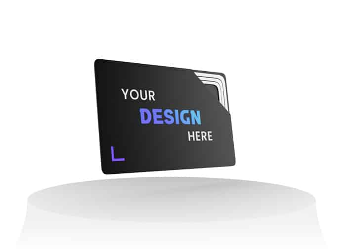
Why not opt for the connected business card?
While we’ve already discussed the features of printed business cards, there’s another option: the digital business card, which lets you enjoy an object similar to a traditional card, but which is also capable of connecting directly to your contact’s smartphone thanks to an NFC chip, in order to transmit your contact details and important information directly to them.
It simply depends on how much information you want to transmit: sometimes, it’s better to occupy both sides of the business card rather than reduce the font size to try and fit everything on one side!
Think of the people whose eyesight isn’t perfect – they’ll thank you!